When managing a fitness club, your success hinges on delivering a great member experience. It’s the key to driving retention, attracting new members, and ultimately boosting your revenue. But if you think that experience starts and ends at the front door of your facility, think again—your fitness club’s website design is just as critical.
Your fitness website is a powerful touchpoint in your members’ journey. In fact, 75% of consumers judge a company’s credibility based on its website design. For clubs, a well-designed website can be the difference between converting a lead into a loyal member or losing them to a competitor. A fitness club website design that inspires trust, showcases your offerings effectively, and provides a seamless user experience is essential to your club’s growth.
To help your club achieve this, here are four proven ways to elevate your fitness website design and maximize its effectiveness in attracting and retaining members.
Why Your Fitness Club Needs an Exceptional Fitness Website Design
If your website’s user experience is frustrating, unintuitive, or unappealing, potential members are likely to move on to another club. Research shows that 38% of people will stop engaging with a website if the content or layout is unattractive, and 88% of online consumers are less likely to return to a site after a bad experience.

By focusing on user experience, mobile responsiveness, and compelling visuals, you can ensure your fitness website design stands out in a crowded market and drives meaningful engagement and growth for your club.
First Impressions Matter
When someone visits your website for the first time, they’re forming an impression of your club. A professional, user-friendly fitness website design can set the right tone, making visitors want to learn more rather than moving on to another option.
A Powerful Sales Tool
Your website is your most powerful sales tool. With the right fitness website design elements, you can guide visitors from curiosity to commitment, turning them into loyal members.
Enhancing Member Engagement
Your fitness website design plays a crucial role in keeping your current members engaged. From providing easy access to class schedules to offering a seamless booking experience, your website should be a hub for everything your members need.
Supporting Club Growth
A well-designed website isn’t just about looking good—it’s about driving growth. By attracting new members, upselling additional services, and improving overall member satisfaction, your website can be a key driver of your club’s success.
4 Ways to Improve Your Fitness Website Design
Let’s dive into four actionable strategies that will help you level up your fitness website design and convert more visitors into members.
Cover the Basics
Ensure your fitness website design includes all essential information that visitors need to make a decision about joining your club. If key details are missing, you risk losing potential members before they even set foot in your facility.
Every fitness website should include:
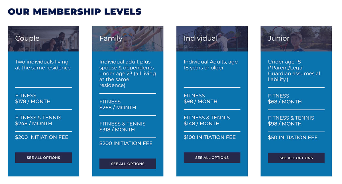
- Membership options
- Descriptions of amenities
- Testimonials from satisfied members
- Class schedules and updates
- Contact information
- High-quality photos of the facility
- “About Us” information
- Profiles of staff and personal trainers

Make your fitness website design as intuitive as possible by comparing it to other top-performing fitness websites. Identify what makes their layouts easy to navigate and apply those insights to enhance your own site’s user experience. A good online experience often translates to a positive experience within your club, so make sure your site sets the right tone from the start.
Build Trust Through Consistency
Creating a fitness website design that is visually appealing and strategically aligned relies heavily on consistent branding. Think about the brands you trust—those that consistently deliver quality and service. What is it about their online presence that inspires confidence?
Fitness clubs can build trust by maintaining consistent messaging and design across their digital touchpoints. Use your website to clearly communicate your offerings and showcase what makes your club unique. Your fitness website design should help potential members visualize what it feels like to be part of your community. Incorporate high-quality videos and images to highlight your club’s vibrant atmosphere and connect with leads on a personal level. Additionally, this assists you in improving member retention and loyalty.
Be Highly Searchable and Mobile-Friendly
Your fitness website design is only effective if potential members can find it. To maximize visibility, implement search engine optimization (SEO) best practices, such as optimizing your Google My Business listing and using relevant keywords across your site’s pages and content.
Make your website more search-friendly by:
- Using descriptive link text
- Adding alt text to images
- Including a sitemap in your robots.txt file
- Writing clear and concise meta descriptions
- Avoiding unnecessary symbols and jargon in URLs and headers
- Utilizing title tags and meta descriptions for each page
Since over 60% of website traffic comes from mobile devices, your fitness website design must be mobile-friendly. Research shows consumers don’t have a lot of patience for hard-to-access websites. Roughly 8 in 10 customers will stop engaging with content that doesn’t display well on their device. Ensure your site is responsive, automatically adjusting its layout for different screen sizes, and provide a smooth experience on all devices. Websites that are easy to navigate and visually appealing on mobile devices will capture more leads and keep them engaged.
Make Sign-Up a Breeze
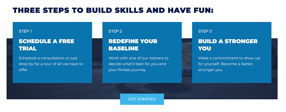
Generating new memberships is a top priority for your club, and your fitness website design should make the process as easy as possible. Include prominent calls-to-action (CTAs) like “Sign Up Now” or “Get a Free Trial” on your homepage and throughout your site. Placing CTAs above the fold increases visibility and encourages visitors to take action without scrolling.
To further enhance lead capture, use lead forms that integrate with your club management software. Ensure these forms are mobile-friendly, as over half of all web traffic is from mobile phones. With 78% of customers buying from the company that responds first, your sales team needs to be the first to respond if your lead capture form is going to successfully convert leads. Integrate your online lead capture forms with your marketing automation tool to notify your sales team instantly when a lead submits a form.

Ready to Elevate Your Fitness Website Design?
A well-designed fitness website is a critical tool for attracting and retaining members. By implementing these best practices and drawing inspiration from real-life examples, your club can create an engaging, effective online presence that drives growth and enhances member satisfaction.
Want to learn more about optimizing your website and driving membership growth? Schedule a demo with Club Automation today and discover how to build a dynamic, member-centric website that stands out from the competition.


